Refund Selection
What it is: Refund Selection is a responsive web application that guides users through a financial enrollment process.
Our solution: To engage users and reduce abandonment rates, we divided a sign up application into manageable chunks, decreasing cognitive overload among users.
MY ROLE
We were tasked with overhauling the user experience and front-end framework for Refund Selection, an online enrollment application. As the UI/UX Designer, my initial responsibilities were conducting UX research, sketching initial ideas, wireframing, and designing the app's UI. I was soon promoted to UI/UX Engineer, where I created interactive prototypes and assisted the engineering team with final front-end implementation.
THE CHALLENGE
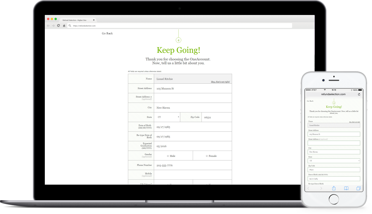
Financial aid is a necessary part of life for millions of students. For many, this aid is their sole means of support while attending college. It is for this reason that the enrollment process it is so important. Since it is through this process that students make decisions about how they will receive their financial aid disbursement, instructions need to be clear, easy to follow and transparent. To enroll for this service, students have to provide a significant amount of information (read: dozens of form fields!) and assess which financial choice is best for them. Our objective was to strike the right balance between providing enough information and guidance and keeping the UI simple to reduce cognitive overload.
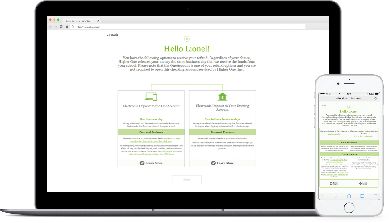
In the previous version of Refund Selection, the drop off rate increased on the student choice screen. This is the point in the flow where students make their final decision on how to receive their financial aid disbursement. We knew we needed to make significant improvements to this screen.
A significant consideration was to make sure that any modifications we made were compliant with Department of Education regulations. One requirement was to make sure that we did not advertise the company's products before students had made their financial aid disbursement decision. Another requirement was to present the refund choices side-by-side, both on mobile and non-mobile devices.
THE APPROACH
To better understand how our target users (college students) interacted with technology, we conducted on-campus observation sessions in which we studied the specific ways in which students use their phones and laptops. We also consulted our web analytics data and learned that more than 50% of web traffic was coming from mobile devices. Given such wide use of mobile devices it stood to reason that college students were using their phones for banking. We knew that we had to make mobile access easy.
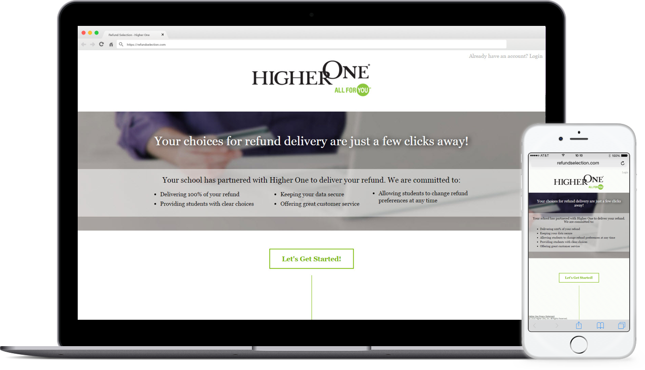
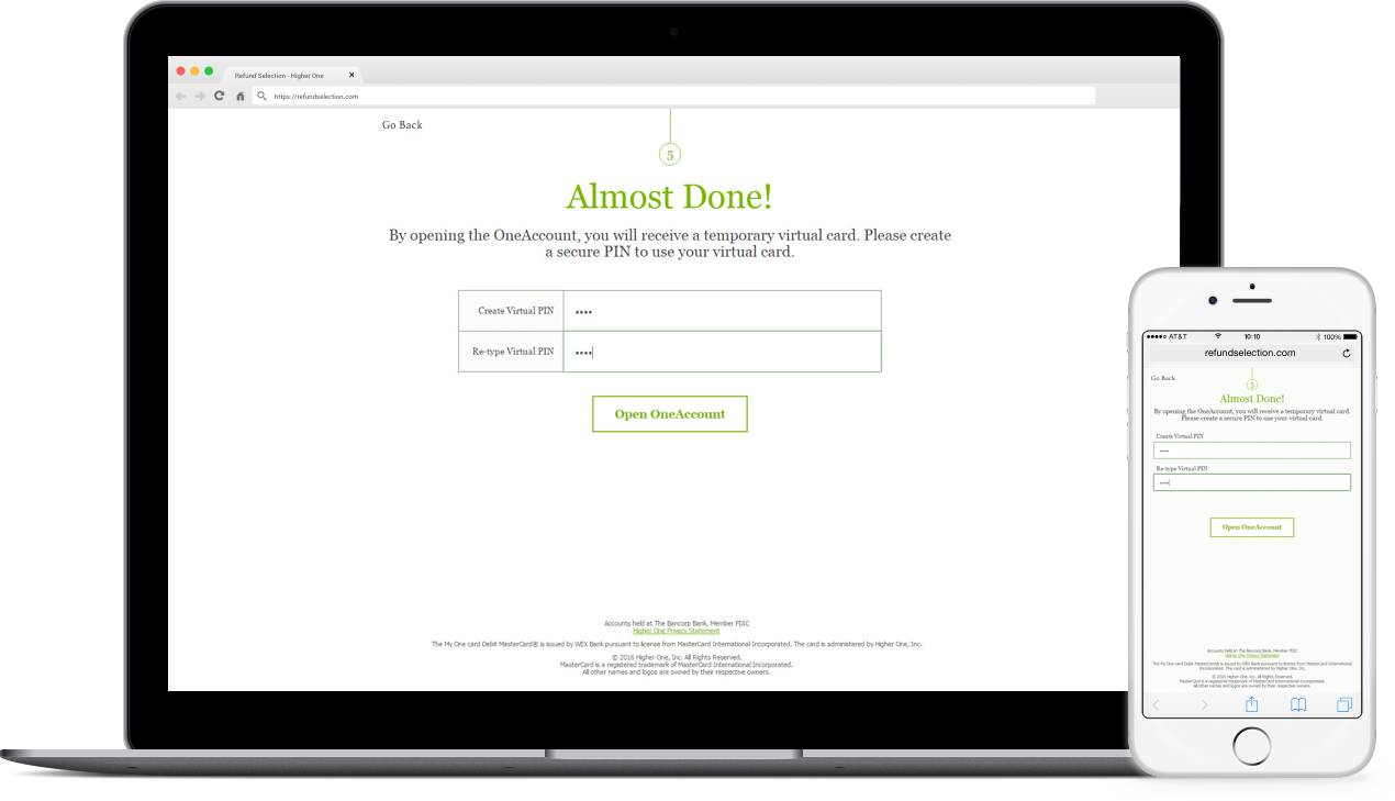
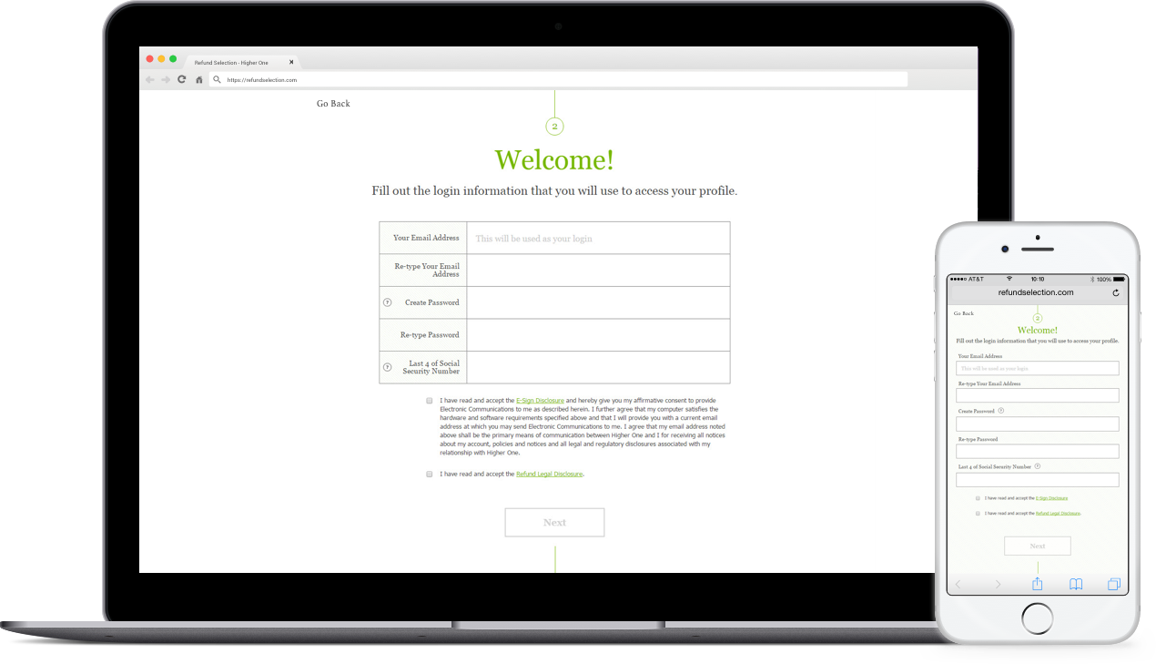
To simplify the UI, we decreased the amount of information students saw on each screen. Instead of having to fill out all of their information on one long screen, for example, we separated the process into five distinct steps. We added animated page transitions between each step so that students could track their progress.
THE REQUIREMENTS
In order to accommodate the large and growing number of mobile phone users, we removed sidebars and advertisements and created a one column layout that eliminated distractions from the UI and allowed students to easily input their information from any device.

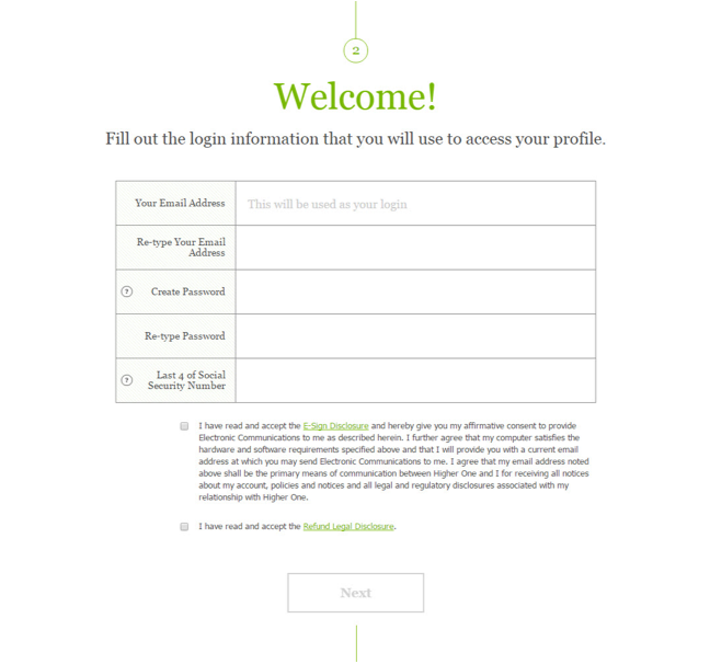
We now had to add visual cues to relate them in such a way that it was clear they belonged to the same process. Our goal was to for students to see that with the completion of every small form, they were one step closer to finishing the entire process. Each section was numbered with vertical lines connecting each form to the next one.
THE FRAMEWORK
During initial sketches, the team explored a two column annotated approach. This offered the advantage of closely guiding the user through the process. Though encouraging during early design stages, this two column layout proved challenging as the scope of the project expanded and as we were desiging our mobile approach. Since responsiveness and ease of use was a high priority, we changed course and went forward with a single column.
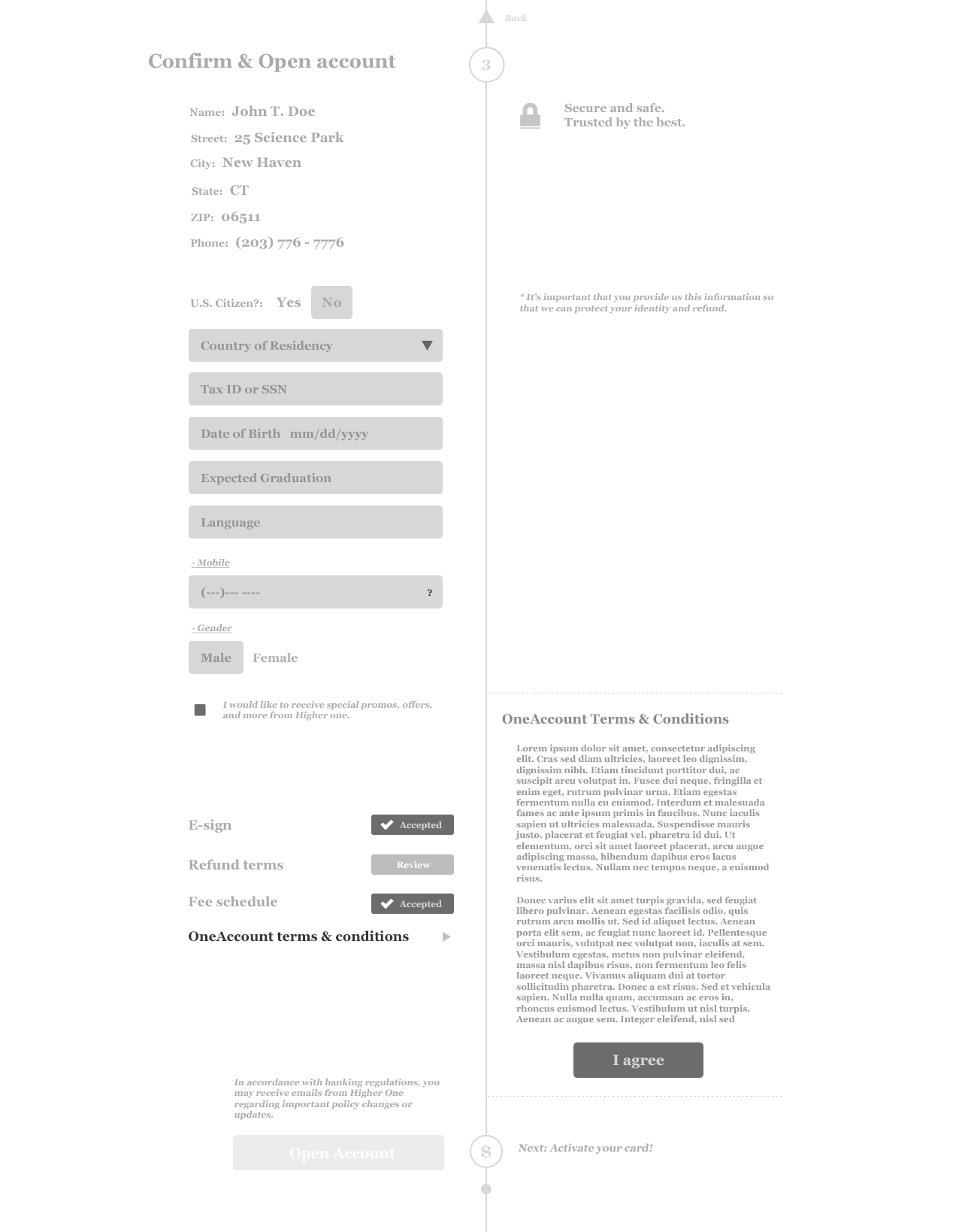
This project offered the team a tremendous opportunity to re-build the web app from the ground up. We were able to use the latest front-end technologies, such as Angular for our front-end framework and Sass for our CSS preprocessor. We also made sure that we were coding using best practices for accessibility.
THE FINAL DESIGN
Through our research we learned how our students use the Refund Selection site. Since they're busy and on the go, we knew we had to provide them with an enrollment process they could do on any device, and anywhere. The process had to be fair, transparent, and compliant with the Department of Education regulations governing Title IV disbursements. By tailoring this experience to our users, we were able to design a web app that was clean, focused and easy-to-use.